2019 Conforming Loan Limits for Seattle and King County

2019 will bring higher conforming loan limits for homes located in King, Snohomish and Pierce Counties. Loan amounts over a conforming loan amount for which the property is located in is considered “non-conforming” or a “jumbo” mortgage.

For 2019, the conforming loan limits for King, Pierce and Snohomish Counties are:

  • One Unit: $726,525
  • Two Unit: $930,300
  • Three Unit: $1,234,475
  • Four Unit: $1,397,400

Technically, the loan limits for King, Snohomish and Pierce Counties are called “high balance conforming” as the loan limits are higher than the “true” conforming loan limits (which the rest of the state has for conforming loan limits).

For homes located in Washington state in any other county, the conforming loan limits are:

  • One Unit: $484,350
  • Two Unit: $620,200
  • Three Unit: $749,650
  • Four Unit: $931,600

When structuring your mortgage scenario, it may be more beneficial to have a “true conforming” loan amount vs. a high balance mortgage depending on your scenario and how rates are currently priced. It’s not unusual to see jumbo rates more favorable than “high balance” or “true” conforming. It’s important to work with a licensed local loan officer who will check out the various options that may be available to you.


Seattle Ain’t What It Used To Be – Home Stats

In 2004 over 17,000 Residential Properties sold for $400,000 or less In Seattle. Now…less than 1,300.
In King County the number dropped from over 30,000 to a little over 8,000.

In 2004 only 333 houses sold for more than $900,000 in Seattle. Now…over 2,600.
In King County the number increased from 1,050ish to almost 7,400.

It’s not merely about median price increases. It’s about the displacement of people who are making the median income or less being replaced with a whole different income class.

Here’s a visual.

I was running stats for a different reason. Given the recent change/slump that has been broadly recognized both here and in many places around the Country, it’s a good time to take stock of where we are and where we are going and to some extent…where we need to be going.

Below is an almost complete visual of all of the stats I was running for King County, Seattle and The Eastside. I used “Kirkland, Bellevue and Redmond” as a brief snapshot of “The Eastside”. Looking at the data is like looking at clouds. Everyone sees something a little different. But for me the top photo snapshot is pretty jaw dropping.

It pretty much explains why the Homeless Problem is growing. It pretty much explains why Democratic Socialists are popping up everywhere. It pretty much explains why there is a public outcry for some type of relief. The change in housing…not simply appreciation…but the disappearance of some lower income options being replaced by truly Luxury Priced options is astounding!

I didn’t separate the types of residential properties. I usually do, but in this case it really doesn’t matter WHAT the 919 less than $170,000 options were (red graphs below). That the number dropped to 34 is eye opening. Maybe they were manufactured homes. Maybe they were the “crap” houses newcomers often complain about. Still they were homes, and maybe to some extent this explains why people in that income bracket now have to live on the street or in their cars or in campers parked in someone’s driveway.

I’m posting these here as part of a bigger conversation somewhere else. The stats are not 100% accurate as many builders buy their low end teardowns off market and many high end homes are custom built or sold outside of the normal listing system. But given what we have to work with…this is a tale that deserves an in depth study. Clearly those reaching out for solutions to the Homeless Problem should be armed with some data like this showing prices have not only gone up…large numbers of people have been displaced. This doesn’t even count the number of apartments that tossed out all the renters and converted to condos since 2004. Just a huge change in the name of progress.

I have to admit I was dumbfounded by all of the angst against the Tech Companies in recent times…but looking at this data, well it all makes a lot more sense. Doesn’t it?

(Required Disclosure: Stats in this Post are not Published, Verified or Compiled by The Northwest Multiple Listing Service.)

Another reason I have been working on Stats is because the DOW just went up over the January 26, 2018 Peak and so is technically out of the Correction Phase. Median Home Prices should reflect a 10% to 20% downward adjustment from the 2018 peak by year end. But looking at where we are…that’s not going to help much. Is it?

Last Call – Seattle Real Estate

I just wrote this as a comment on Seattle Bubble and decided to share it here. I have not been “blogging” here or elsewhere, given most of my “writing” attentions have been on Quora Real Estate answering people who ask me specific questions or on Seattle Bubble when people are not beating each other up with Political Sticks.

But this seemed worth sharing beyond a mere comment on someone else’s blog.

ARDELL DellaLoggia says:
July 10, 2018 at 12:55 pm

It might be a bit nonsensical to some to believe that the market would end it’s upswing after 7 years of full upswing from 2012 forward. I have always believed that an upswing lasts 5 to 8 years, and while I can’t google it, I’m 99% sure I heard that from Greenspan back before my children were born. 7 years is the most predictable time, but it could end as early as 5 or later than 7, but not usually much later. I think the longest standing upswing went for part of the 8th year, and here we may be the same for early next year, just as our most recent crash began in August after “the season” was over.

I’m seeing enough fuel in the hottest of areas to make it through early next year, but more like a vehicle that was going so fast that its coasting period lasts longer than a vehicle that was going slower.

There is absolutely NO reason for a seller to not be selling, if they have been thinking of selling or will need to sell within the next 5 years. But I have been saying that since the beginning of 2017.

https://www.cnbc.com/2018/07/09/the-hottest-housing-market-in-the-country-may-be-headed-for-a-crash.html

While the above article may not validate my long standing prediction, it certainly lends credence to it.

I have been saying “It’s a better time to sell than to buy” for awhile now, and none of my clients have been blind to my recommendations. That does not mean everyone sells and nobody buys, but informed consent is the most important part of a transaction.

Anyone not being increasingly pessimistic about the market since late 2016 or early 2017, or now, likely has a biased reason to not believe the obvious.

********************
That is the end of my published comment from this morning. If you have questions, feel free to ask them in the comments here OR on Quora OR on Seattle Bubble.

2018 Home Prices in Redmond 98053

Before the graphs, time to mention that there were 572 homes sold in Kirkland 98033 last year, 625 homes sold in Kirkland 98034, 620 homes sold in Redmond 98052 compared to 352 sold in 98053. The 2 active listings at $2.5M+ are extremely large land parcels with a home on each.


More Zip Codes to follow in subsequent posts. Some will be Eastside and some will be Seattle, but only in places where I work, so mostly North of Downtown in Seattle plus Shoreline, Kirkland-Bellevue-Redmond, Issaquah-Sammamish and bit of Bothell on The Eastside.

ARDELL DellaLoggia, Sound Realty – 206-910-1000 cell – ardelld@gmail.com email

Required Disclosure: Stats in this post are hand calculated by ARDELL in Real Time and not compiled, verified or published by The Northwest Multiple Listing Service.

Related Posts
2018 Home Prices in Kirkland 98033
2018 Home Prices in Kirkland 98034
2018 Home Prices in Redmond 98052

2018 Home Prices in Kirkland 98034

First the graphs…


Again, similar to my 98033 post earlier today, there is nothing for sale and not unusual for this time of year. The height of the For Sale and Pending graphs is the average # of homes sold in one month based on 2017 sales IF every month were the same. In 2018 in 98034 it will still be the same “what’s new this week” with everything coming on being sold in a week or less unless it is overpriced.

The main reason for me to post these by zip code snapshots this time of year is for people who need to know where they can afford to live. In that regard, Kirkland 98034 is much more affordable than Kirkland 98033. So when you say you want to live “in Kirkland”, not that by price point you may mean what is sometimes called “the other Kirkland”.

Again, I have coded the more likely price ranges in green tones. But given compared to 98033 the green tones in 98034 all bulk up between $500k and $1M, much unlike 98033 Kirkland, I have added a 2nd pie chart breaking the affordable prices into smaller, 100k, segments.

The big NEWS segment of these 98034 stats is that a large number of pending sales are in the $1M to $1.250M range. Only 44 SOLD in the price range in 2017, but ore than half of the current pendings waiting to close (mostly if not all new construction) are in this price range.

The DOW just went over 25,000 this morning and there is no product for sale. Expect another big climb in prices in the first half of 2018.

More Zip Codes to follow in subsequent posts. Some will be Eastside and some will be Seattle, but only in places where I work, so mostly North of Downtown in Seattle plus Shoreline, Kirkland-Bellevue-Redmond, Issaquah-Sammamish and bit of Bothell on The Eastside.

ARDELL DellaLoggia, Sound Realty – 206-910-1000 cell – ardelld@gmail.com email

Required Disclosure: Stats in this post are hand calculated by ARDELL in Real Time and not compiled, verified or published by The Northwest Multiple Listing Service.

Related Post 2018 Home Prices in Kirkland 98033

2018 Home Prices in Kirkland 98033

First the graphs…


Of course there is nothing for sale, but not unusual for this time of year. The height of the For Sale and Pending graphs is the average # of homes sold in one month based on 2017 sales IF every month were the same. In 2018 in 98033 it will still be the same “what’s new this week” with everything coming on being sold in a week or less unless it is overpriced.

The main reason for me to post these by zip code snapshots this time of year is for people who need to know where they can afford to live. For instance if you want to buy a house vs a condo and you want to spend less than $500,000, now you know that only 6 properties sold in all of 2018 for less than $500,000, so you may be barking up the wrong tree in 98033. I will try to post this same data for the zip codes where I work, today if possible, to keep everything on an even keel.

I have coded the more likely price ranges in green tones, the not likely ones in red tones (but somewhat more for sellers than buyers) in the pink-red and the yes, but be discerning please, are blue.

That inventory is non-existent should not be a surprise to anyone. Only FOUR houses for sale under $1.25 Million might be a bit surprising to some and NONE under $500,000 might be a surprise to some before reading this post and viewing the first graph.

The DOW just went over 25,000 this morning and there is no product for sale. Expect another big climb in prices in the first half of 2018.

More Zip Codes to follow in subsequent posts. Some will be Eastside and some will be Seattle, but only in places where I work, so mostly North of Downtown in Seattle plus Shoreline, Kirkland-Bellevue-Redmond, Issaquah-Sammamish and bit of Bothell on The Eastside.

I posted the Pending sales as well so that people can see what recently sold but didn’t close yet. Not quite as bad as the For Sale stats, but still pretty dismal…or GREAT!…depending on whether you are a buyer or a seller.

ARDELL DellaLoggia, Sound Realty – 206-910-1000 cell – ardelld@gmail.com email

Required Disclosure: Stats in this post are hand calculated by ARDELL in Real Time and not compiled, verified or published by The Northwest Multiple Listing Service.

Related posts 2018 Home Prices in Kirkland 98034

2017 Home Prices in Kirkland

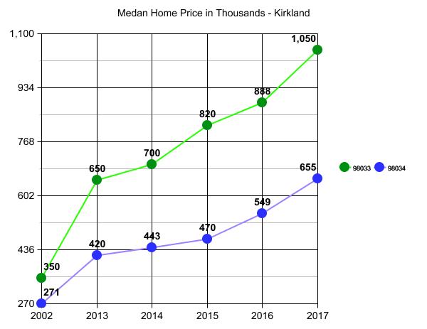
I have jumped ahead from near the end to post this at the top. Notice that the movement in 98033 pushes the prices in 98034 with a one year lag. The huge movement in the 2014-2015 period in 98033 caused the same movement in 98034 in 2015-2016. We saw this before in the last bubble, especially in the condo market. When Downtown became too expensive the Juanita Beach area started pushing up to a greater degree. But I’m jumping ahead…back to the beginning.

Here is a map and description of all of the neighborhoods of Kirkland from the Kirkland City site. I find “by Elementary School” in Lake Washington School District to be more relevant to prices than “Neighborhoods”, so I will be using “by Elementary School” for price stats near the end. The links above give you the Neighborhood Maps, the School Boundary Maps and the School Rankings in case you need a little help relating the data to the specific price areas.

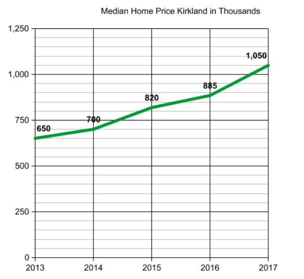
We’ll start with the broadest area, all of Kirkland, pulling the data by the two Kirkland Zip Codes of 98033 and 98034 separately. Generally speaking one would expect 98033 homes to cost more than 98034 homes when looking at the area median home price. That has more to do with proximity to Downtown and more land area with views and access to Lake Washington than most anything else. Let’s see if that continues to hold true in 2017, while at the same time calculating rate of price growth over the last 5 years. For consistency I will use a 12 month rolling basis from 9/16 to 9/15 but will call the year by it’s end date.

For 98033 the current 12 month rolling median price in Kirkland 98033 is $1,050,000, up from $650,000 5 years ago.

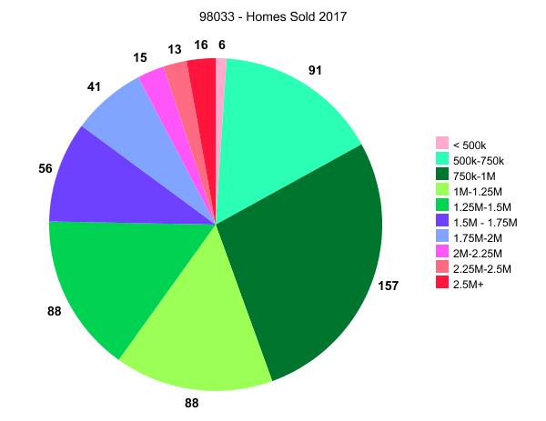
In addition to knowing the median price (half sold for more and half sold for less) I find it more relevant to know the price at which MOST people purchased and for how much. Doing this for 9/16/2016 to 9/15/2017 – 12 month period – and not for all five years. Here is where we have been in the last 12 months as to who bought and for how much in 98033.

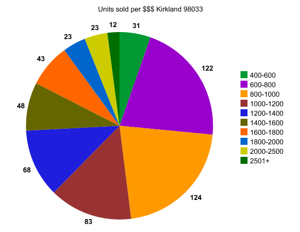
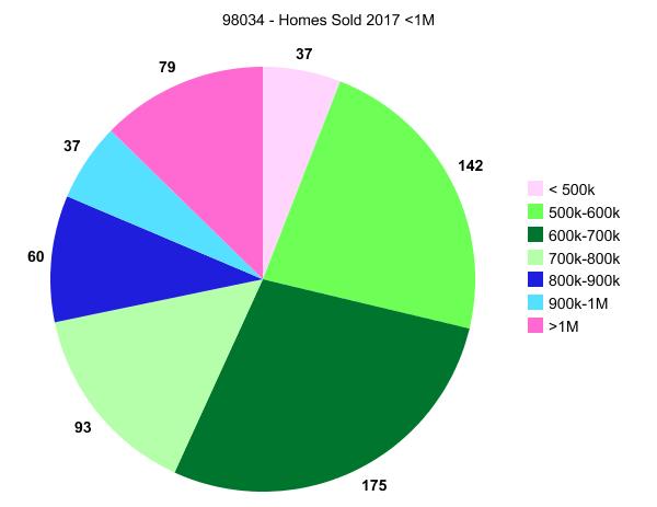
To break the above pie down even further, 23 of the 31 “up to $600,000” were between $500,000 and $600,000 and only one was $400,000 or less. 69 were between $700,000 and $800,000 and 74 were between $800,000 and $900,000. About 45% were between $600,000 and a million.

NOTE: Median Condo Price for 98033 for the same period was $625,000.

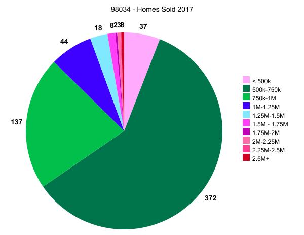
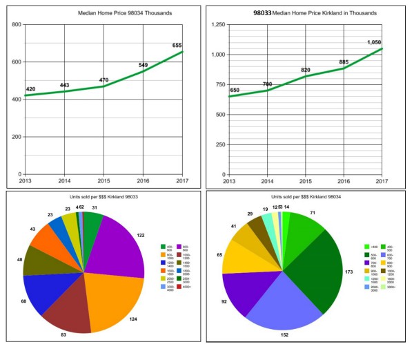
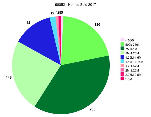
Running the same numbers for 98034. …the results are pretty astounding so I’ll post those before the commentary. I am calculating the data as I type this and I adjusted the visual a bit as to coloring on the pie graph so that you can see more clearly the part I find pretty astounding. Showing the results side by side.

Restating the 5 year growth for Kirkland by Zip Code on the same chart vs separately so that the visual is more relevant with the end amount being consistent for both. For kicks I added the 2002 median price as the start point so we can compare the last 5 years with 15 years ago.

I moved that graph to the top as well for people who just like to glance and go.

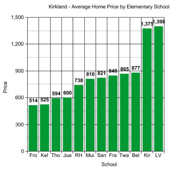
I want to move on to Bellevue and Redmond to compare to Kirkland, but I promised prices by Elementary School back at the beginning. I did this one back in March by Average Price vs Median Price and will try to come back and update it. But for now it gives you a rough idea of the variance from one Elementary School Boundary Area to another. As you can see from the dot to dot, 9/16 to 9/17 had a 19% push up in both Zip Codes equally. So I’d say add 10% to those March 2017 Average Prices in the bar graph for now.

Here is the key. To see where these fall geographically go to the Lake Washington School District Boundary Map though for some reason the “new” map seems to be a lot harder to follow than the one I’ve used for many years which was interactive. For now I’ll just throw the Zip Code on for you.

Fro = Robert Frost Elementary 98034, Kel = Helen Keller Elementary 98034, Tho is Henry David Thoreau Elementary 98034, Jua is Juanita Elementary 98034, RH = Rose Hill Elementary 98033, Mui = John Muir Elementary 98034, San = Carl Sandburg Elementary 98034, Fra = Benjamin Franklin Elementary 98033, Twa – Mark Twain 98033, Bel = Alexander Graham Bell 98033,Kir = Peter Kirk Elementary 98033, LV = Lakeview Elementary 98033

The large marjority of homebuyers are choosing by Elementary School and Elementary School rank with an overlay of commute considerations. So breaking down price by Elementary School becomes important so a buyer can readily see that the price tag of Lakeview Elementary is much higher than the price tag of Sandburg Elementary, as example. But calculating the median price by school boundary is extremely tedious, so here is March 2017 and I’ll try to do all of the polygon search fields by year end.

There’s Kirkland at a glance. I find all this ridiculously fascinating though I think many would be bored by now. I run these numbers for myself to keep my perception in line. Even though I do this all day, every day, out in the field, it still amazes me when I line up the data.

It’s always good to check and correct your perspective…as often as possible. I do it for myself…but hopefully you enjoyed at least some of it. 🙂

Required Disclosure: Stats used in this post and graphs are hand calculated by Ardell and not compiled, verified or published by The Northwest Multiple Listing Service.
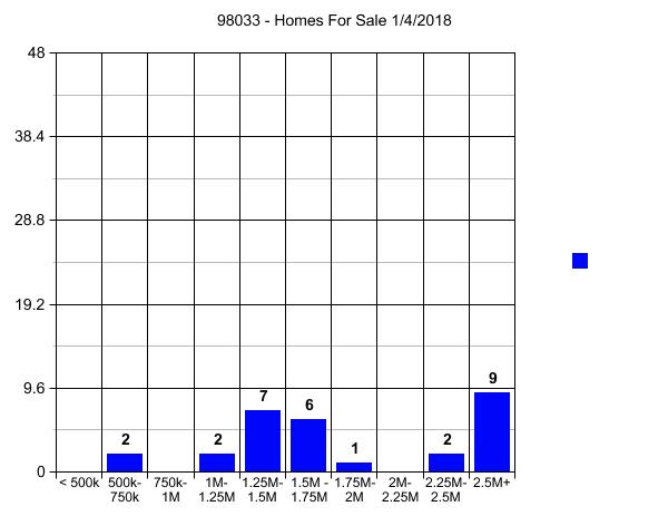
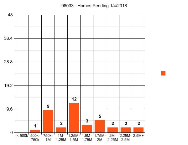
Faira: Beware the Free Lunch (Unfaira?)

This is Craig’s blog series (see Part 1 and Part 2) exploring why and how most realtors don’t talk openly and frankly about the fees they charge. The third and final installment:

Startup Real Estate Firm Faira Promises More than it Delivers

Seattle is Ground Zero for innovation in the real estate industry. WaLaw Realty, Redfin, and of course Added Equity all offer consumers an improvement on the traditional experience (whether cost, or service, or both). And many other alternative models have come and gone over the last decade or two (such as Quill Realty and Rebls).

The most promising model today seems to be Faira. With ads on buses and in the media, Faira is getting some traction. It is also getting news coverage, most recently this piece from KIRO 7 last month. And why not? Faira’s marketing pitch is remarkable:

Faira Home Page

Yep. Free. F-R-E-E. Nada. Zilch. Nothin’. You pay them zero and Faira helps you sell your home. Wow. That is a really good deal. Honestly, it sounds like a deal too good to be true.

Which is exactly right. There is no such thing as a free lunch. Sellers pay for Faira’s services, and they aren’t “free.” Faira doesn’t give away its “secret sauce recipe” easily, though. The Faira Listing Agreement is convoluted and confusing, but two parts really stand out.

Faira Services are FREE to the Seller

Paragraph 2: “Fees: Free.”

OK, simple enough. Not to wordy, gets the message across nicely.

Except They Aren’t. Seller Pays .5%

Paragraph 8: “There can be two separate list prices on the Faira platform, one for the buyers who are not represented by the agents, therefore saving the Sellers from paying the buyer’s agent fees, and the other for the buyers who utilize the buyer’s agents. Sellers understand that this can be perceived that the buyers are effectively paying for their own agent. Further, Sellers agree to include Faira fees in both the list prices. The actual purchase price of the property is 99.5% of the agreed offer between the Buyers and the Sellers.”

Whoa. Wait. What was that last part again???

“The actual purchase price of the property is 99.5% of the agreed offer between the Buyers and the Sellers.”

So the buyer and the seller agree on the price, and then .5% of that amount is paid to Faira. That isn’t “free” to the seller. Obviously Faira charges the seller a half percent. A fact that isn’t changed by a poorly written paragraph of “legalese.”

Or more accurately, if this is free, then EVERY SINGLE REAL ESTATE BROKER is free to the seller. Hire Windermere? It’s FREE – you get 94% of the sale price. Redfin? Yup, it’s free too, you get 96% of the sale price. Amazing what can be achieved with rhetorical gymnastics. Something is reduced to nothing….

Added Equity was built on the notion that real estate could be much, much simpler. Are we concerned about Faira’s success as a competitor? Not in the least. Quite simply, Faira takes a very different approach towards being successful in real estate – ultimately an approach that doesn’t differ much from the traditional model. And we have that beat hands down.

Added Equity charges a real estate agent commission of 1% to list and sell a home. Total. Sellers save a ton of money – follow that link to find out exactly how much.

Real Estate Agent Commissions: The Industry Is Purposefully Vague

Craig is the founder and Managing Broker of Added Equity Real Estate.  Added Equity is different than any other firm. It charges a real estate agent commission of 1% to list and sell a home. Total.

This is Craig’s blog series exploring why and how most realtors don’t talk openly and frankly about the actual fees they charge. This keeps real estate agent commissions at their longstanding high level (and makes it harder for Added Equity to compete on price). The second installment:

Real estate agents don’t do a very good job of telling consumers what they charge.

It’s a fact that real estate commissions have remained largely immune to the downward price pressure exerted by the internet in other industries. This is obviously in the best interests of real estate brokers, and not consumers. How do they do it?

Real Estate Broker Commission Kept High with Ambiguity

The real estate agent commission will go down only when prices are effectively communicated to consumers so that they can make informed decisions. By keeping commissions ambiguous, real estate agents keep them artificially high. How will consumers know of a better deal? They won’t. Real estate agents have a strong personal incentive to “go along” with the system, charge the same high commission as anyone else, and keep it all from the public’s view.

Continue reading